How to Build Your Brand Mood with Custom Backgrounds
Learn how to use Lookbook's custom background feature to create a consistent brand mood across your entire collection — using uploaded photos, AI generation, or curated presets.
Your Background Tells a Story
In fashion photography, the background isn't just filler behind the model — it sets the entire mood. A cozy cafe backdrop tells a different story than a stark white studio. A sun-drenched flower field evokes something completely different from a moody nightclub.
With Lookbook's custom background feature, you're not limited to generic studio shots. You can craft a visual world that's uniquely yours — and keep it consistent across your entire collection.
Why Background Mood Actually Affects Conversion
Customers don't just see your garment — they see your garment in a context. That context tells them, in less than a second, who this brand is for, what price point it lives at, and whether they belong in its world.
A linen dress against a marble countertop reads "minimalist DTC, $180." The same dress against a flower field reads "lifestyle boutique, $90." The same dress against a glossy studio cyclorama reads "fast-fashion bulk, $35." Same garment. Three different customer expectations — and three different conversion rates.
This isn't theoretical. A/B tests on product detail pages consistently show that background-aligned-to-brand outperforms background-mismatched-to-brand by 8–15% on click-through and add-to-cart. The background is a silent brand signal — and AI lets you control it deliberately instead of accepting whatever the studio happened to have.
Three Ways to Use Custom Backgrounds
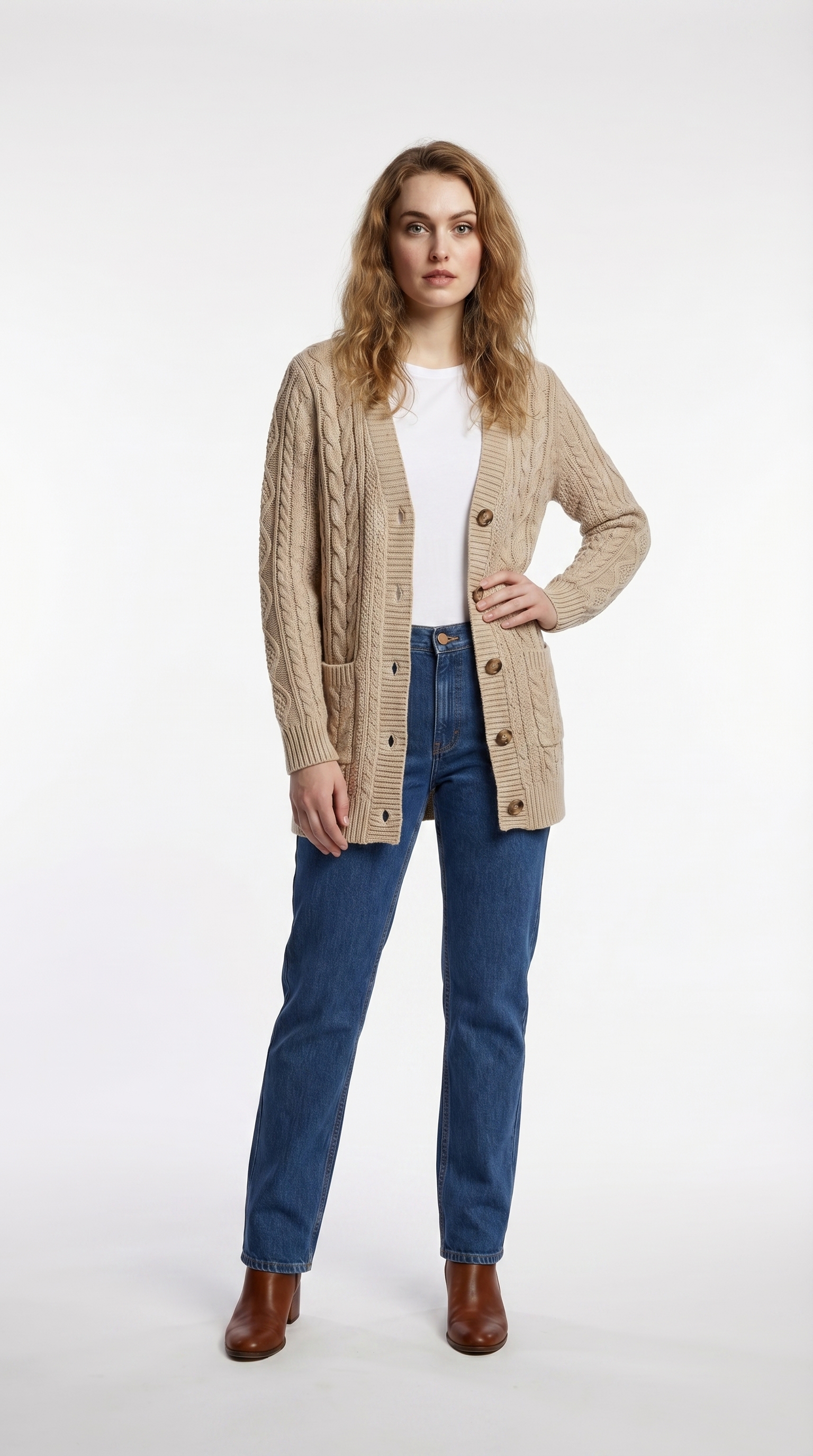
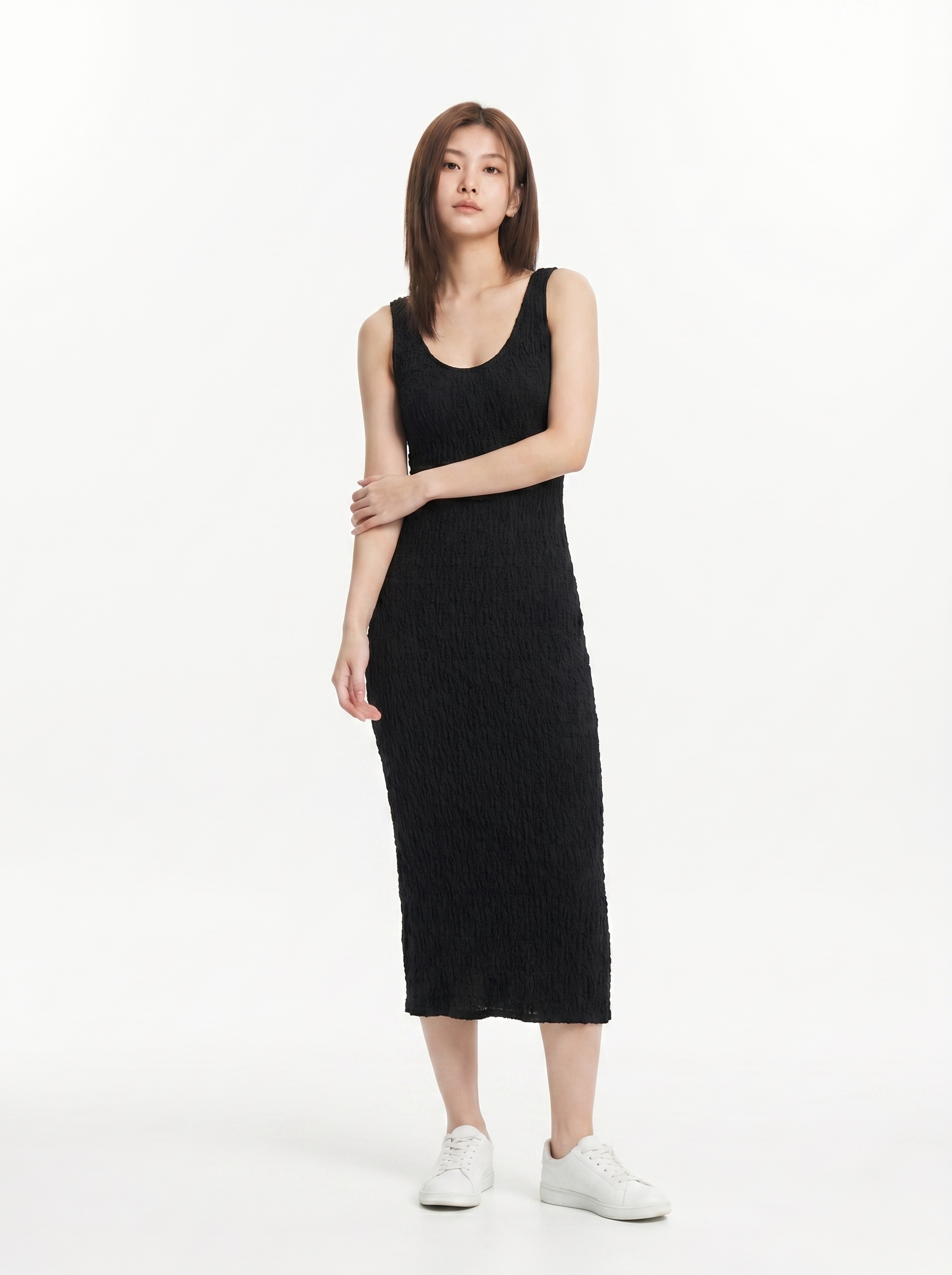
Studio
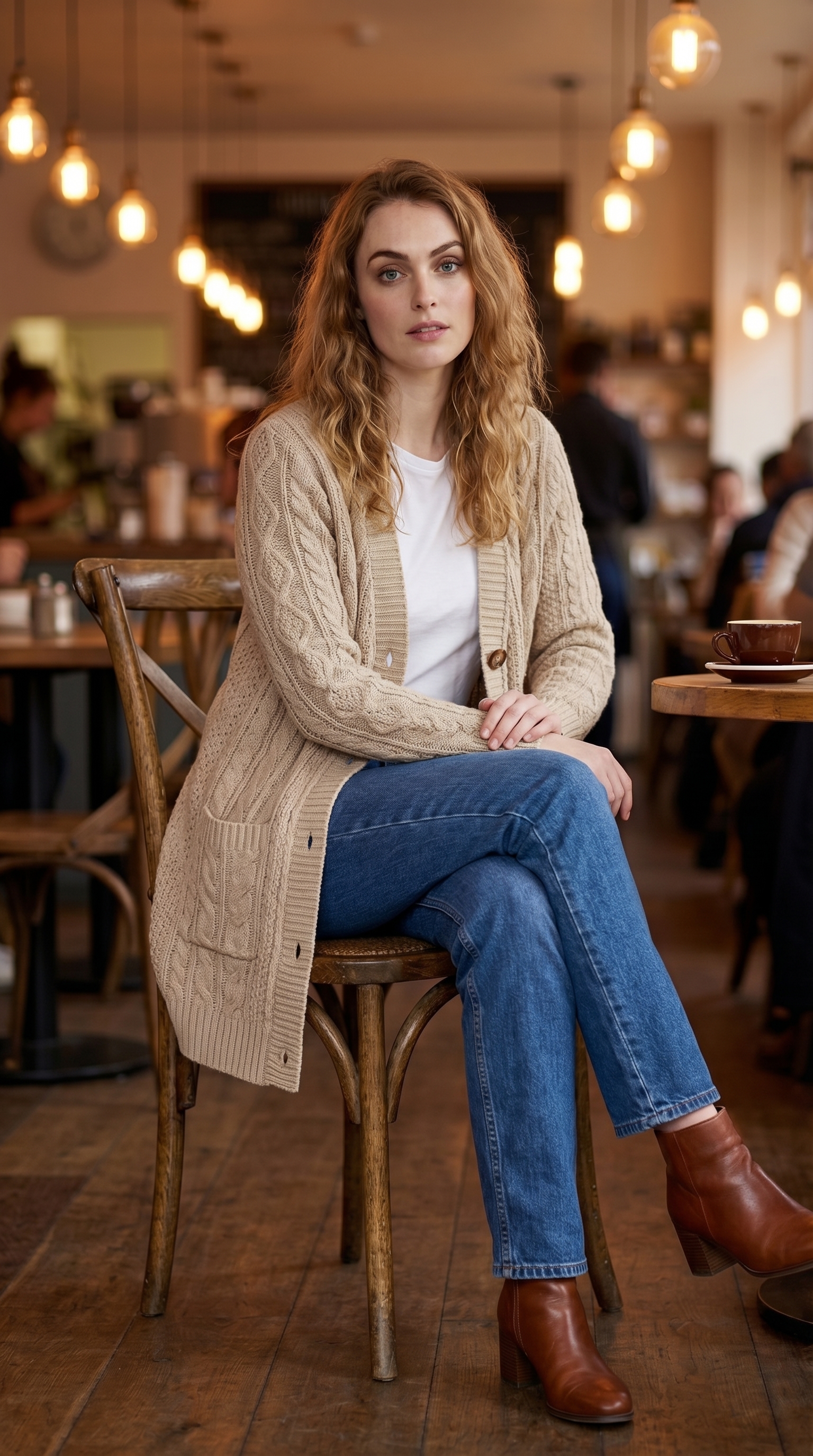
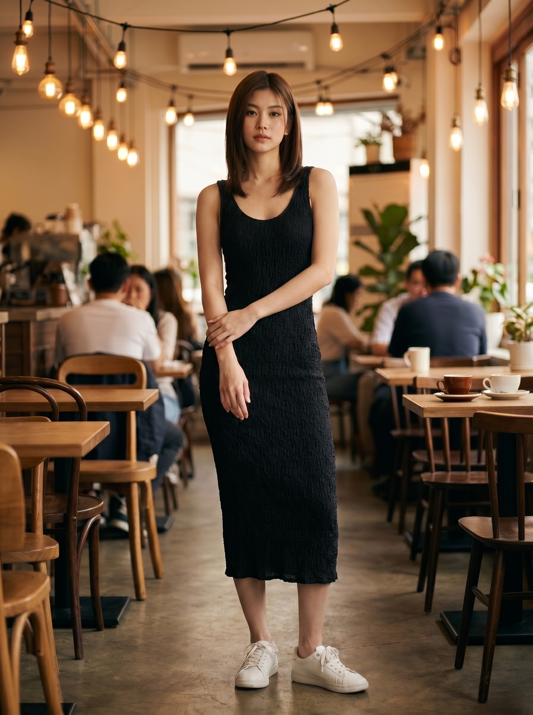
Cafe
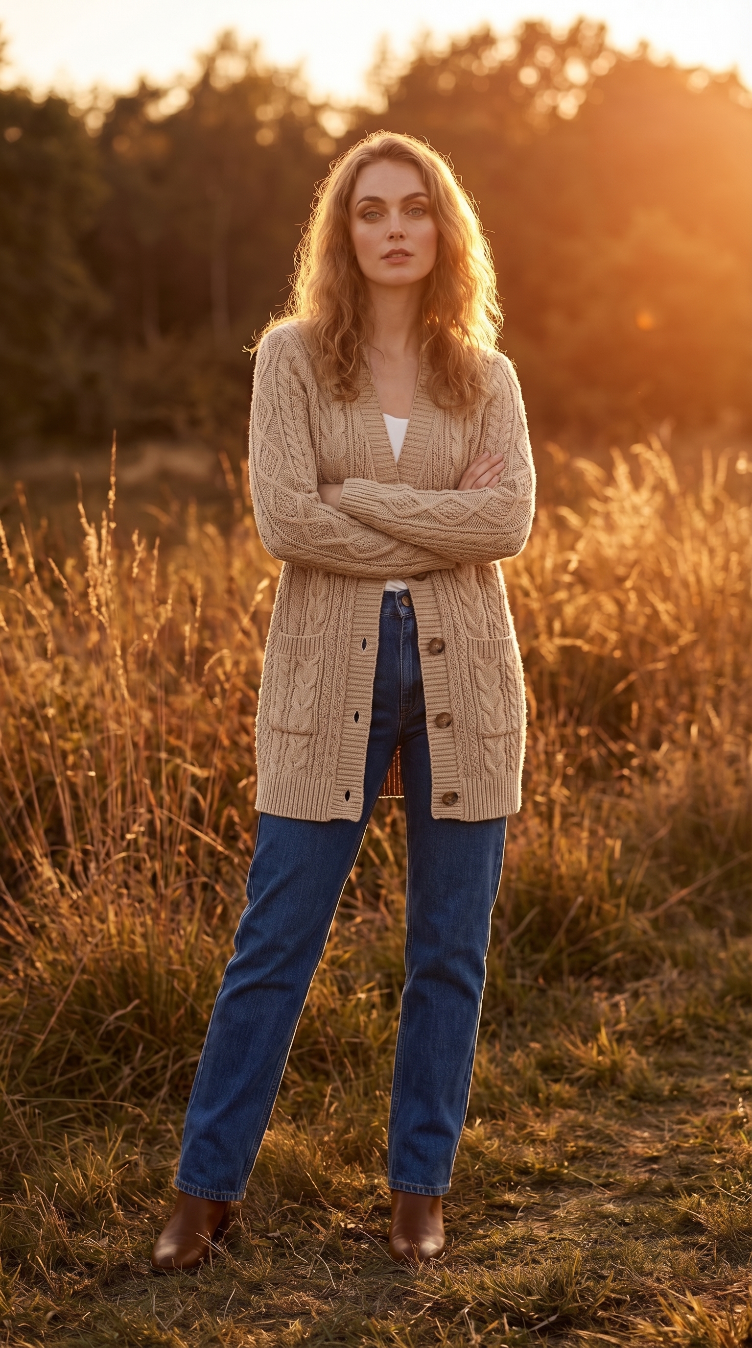
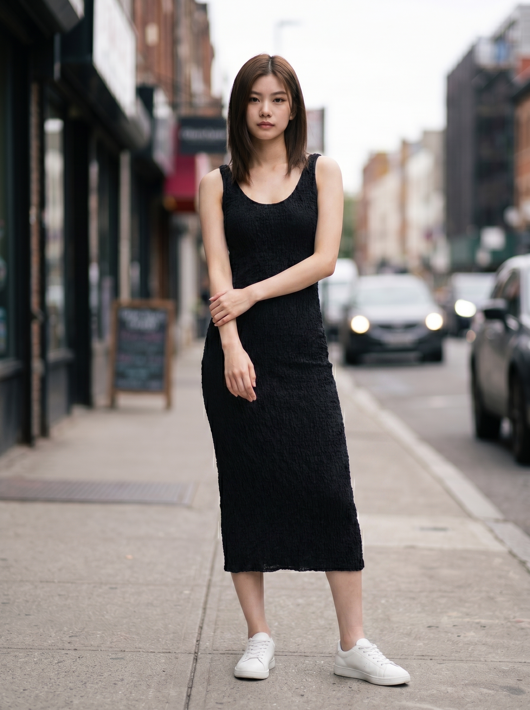
Outdoor
1. Upload Your Own Location Photos
This is the most powerful option. Snap a photo of your actual store, your design studio, or a location that represents your brand. Upload it as a background, and every model shot will feel like it was taken on location.
Tips for great location photos:
- Shoot during golden hour or in soft natural light for the most flattering results
- Avoid extreme angles — eye-level shots work best for placing models naturally
- Leave some open space in the frame where the model will appear
- Indoor spaces with warm, directional lighting (like a window) produce the most realistic composites
2. Generate AI Backgrounds from a Description
Don't have the perfect location? Describe it. Type something like "warm cafe with Edison bulb lighting and wooden tables" and Lookbook generates a photorealistic background for you.
Some prompts that work well:
- Lifestyle: "Cozy apartment bedroom with warm lamp lighting and bookshelves"
- Urban: "City sidewalk with blurred storefronts, overcast day"
- Nature: "Flower garden with afternoon sunlight and mountains in the distance"
- Luxury: "Hotel lobby with marble floors and chandelier"
3. Use Preset Backgrounds
Short on time? Choose from our curated presets — Studio White, Golden Hour, Beach, Rooftop, and more. These are optimized to work well with any model and garment combination.
Brand Archetype → Background Matching
If you're unsure where to start, anchor your background choice to your brand archetype. The same garment reads as a different brand depending on the world you place it in:
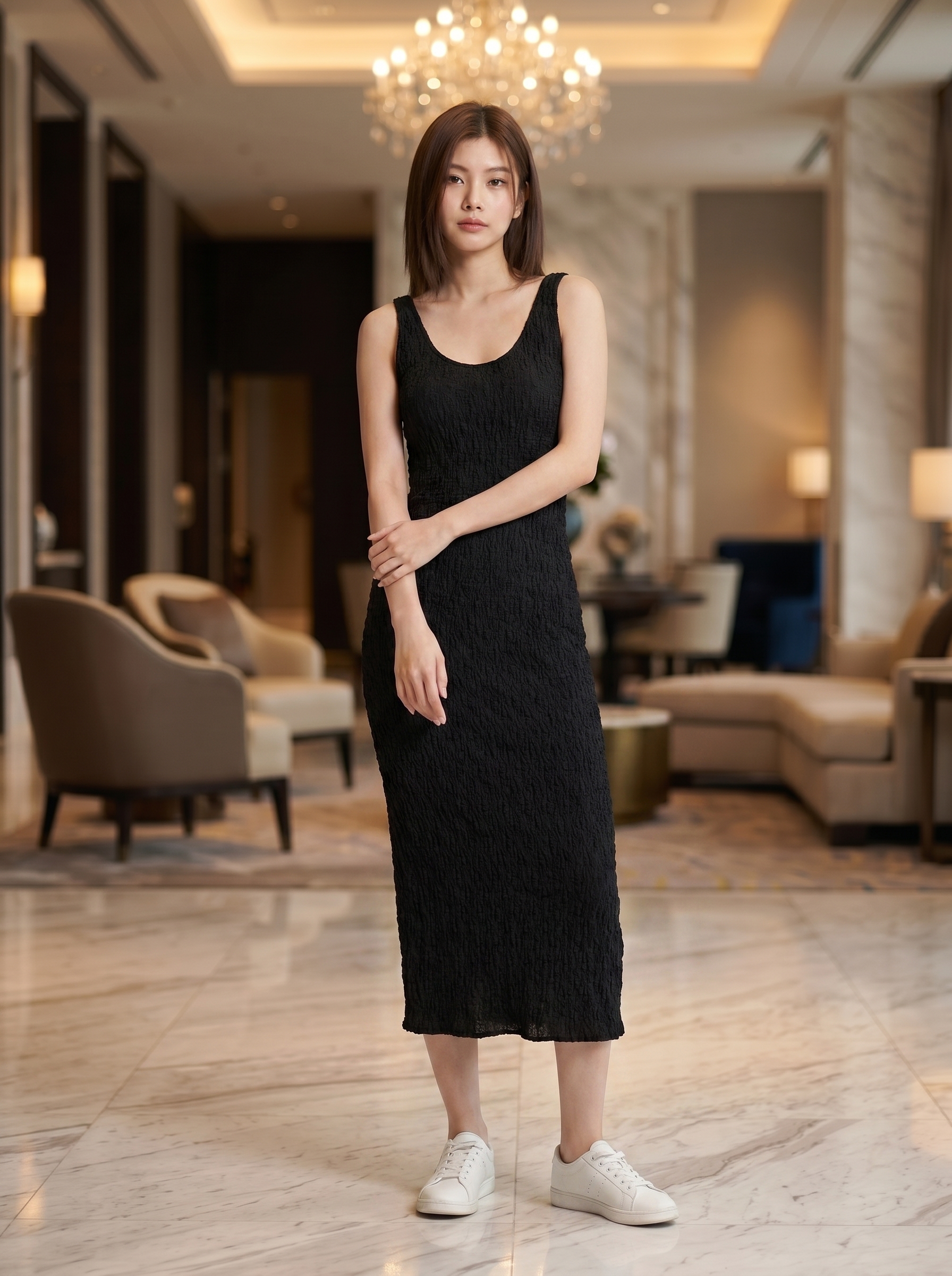
Luxury — marble, chandelier, soft warm light
Minimalist — clean white cyclorama, soft studio light
Streetwear — city sidewalk, urban daylight
Lifestyle — cafe, warm wood, edison bulbs
- Luxury / quiet wealth — marble interiors, stone courtyards, low-key gallery walls, soft directional light. Avoid: clutter, bright color, busy texture.
- Minimalist DTC — neutral plaster walls, single-color seamless, soft daylight from a window. Avoid: high-saturation scenes, dramatic light.
- Streetwear / youth-driven — concrete walls, alleyways, parking decks, neon storefront reflections at night. Avoid: pastoral, hotel lobbies.
- Lifestyle / wellness — cafés, plant-filled rooms, sunlit beach paths, breakfast tables. Avoid: harsh studio cyc, urban grit.
- Vintage / artisanal — warm wood, brick walls, workshop interiors, museum-like backdrops. Avoid: cold modern minimal.
The goal isn't to pick the most "beautiful" background — it's to pick the one that says "this is the kind of person who buys this garment".
Real Brand Scenarios
Indie boutique with 30 SKUs
Maya runs a small label out of her studio. She photographed her actual workspace once — exposed brick, hanging plants, a long wooden cutting table by a window. Uploaded it as her primary background. Every product page now feels like the customer is shopping inside her studio. Conversion lift after switch: ~12% on PDPs that previously used a generic white background.
Minimalist DTC launching a capsule
For their 18-piece minimal capsule, the team generated three AI backgrounds — soft plaster wall, light wood floor, single-window daylight — and reused them across the entire collection. The visual cohesion let them launch without booking any studio time, while still passing the "feels like a real brand" test that their previous template-based product photos didn't.
Streetwear brand for a seasonal drop
For a 40-piece spring drop, the brand generated five different night-city backgrounds (neon alley, parking deck, subway entrance, rooftop, lit-up storefront window) and rotated them across SKUs. Every product page felt like a still from a longer story, without any of them looking templated.
Common Pitfalls and How to Avoid Them
- Lighting mismatch — Background says "overcast sky" but the model is lit like a studio. Fix: choose a model preset whose lighting style matches your background's mood (soft for cloudy, hard for direct sunlight).
- Scale mismatch — Model appears too small or too large for the scene. Fix: pick backgrounds with clear depth cues (a doorway, a table edge) so the AI has anchors to size against.
- Mood collision — Garment is sleek minimal, background is busy maximalist. The customer's eye doesn't know where to land. Fix: simpler background for visually loud garments, richer background for plain garments.
- Inconsistency across SKUs — Each product page feels like it's from a different brand. Fix: limit yourself to 3–5 backgrounds for an entire season and rotate them deliberately.
- Overprocessing — Uploaded background photo with heavy filters or HDR. Fix: use raw or lightly edited source photos for the most natural composite.
- Seasonal drift — Summer beach scenes still live on your storefront in November, and the brand feels frozen in time. Fix: rotate one or two backgrounds per season, even if the rest stay constant.
- Forced consistency — Reusing the same background for swimwear, outerwear, and accessories alike, regardless of category fit. Fix: keep 1–2 "category-context" backgrounds in reserve for SKUs that genuinely need a different setting.
Maintaining Brand Consistency
The real power of custom backgrounds is reusability. Create one background that nails your brand aesthetic, then use it across every model in your collection. Same vibe, same mood, same story — whether you're shooting 5 items or 500.
Compare this to traditional photography, where matching the exact lighting and location across multiple shoot days is nearly impossible without significant production effort.
Background Reuse Strategy
The brands that get the most out of this feature treat their backgrounds like a small, deliberate palette — not an endless library.
A practical starting point:
- 2 "hero" backgrounds for the homepage and seasonal landing pages
- 3 "workhorse" backgrounds for the bulk of product detail pages
- 1–2 "context" backgrounds for category-specific use (e.g., a beach scene for swimwear, a kitchen scene for aprons)
That's 6–7 backgrounds total — enough variety to keep the catalog from feeling repetitive, few enough that the brand still feels coherent. Refresh 2–3 of them per season to signal newness without resetting your visual identity from scratch.
FAQ
How natural does the model-background composite look?
For lifestyle, urban, and indoor scenes the composite is generally indistinguishable to non-experts. For high-contrast outdoor scenes (bright sun, complex shadows), expect to regenerate once or twice to land on a clean result.
What kind of reference photo gives the best results?
Eye-level, daylight-lit, modest depth of field, no extreme color cast, and the focal area uncluttered enough to place a person. Phone photos work fine — just avoid heavily filtered Instagram exports.
What resolution does the uploaded background need to be?
1500px on the long edge or larger is recommended. Smaller works, but the final composite may look soft when displayed on high-DPI screens.
Can I swap backgrounds seasonally without regenerating every image?
Yes — the model and garment are independent from the background. You can keep your model library stable and rotate backgrounds for fall, winter, spring, and summer drops.
Should I match background to garment color or contrast against it?
Both work, but contrast usually wins for product detail pages where the garment needs to read first. Save matching backgrounds for editorial banner imagery where the garment can blend into a vibe rather than stand out.
How many backgrounds is too many?
If a returning customer can't recognize your storefront at a glance, you have too many. Most brands plateau at 6–8 active backgrounds — beyond that, visual identity starts to dilute.
How to Build Your First Custom Background
- Open the Backgrounds section in your Dashboard.
- Choose Upload or AI Generate — pick based on whether you already have a photo or want to describe one.
- Provide the source — a high-quality location photo, or a vivid scene prompt with lighting and mood detail.
- Save the background with a clear, reusable name (e.g., "Spring2026-cafe").
- Generate model poses using the saved background.
- Reuse across the collection for a cohesive lookbook.
- Iterate — swap or add seasonal variants as your collection evolves.
A consistent visual identity isn't just about logos and colors — it's about the world your brand lives in. Custom backgrounds let you build that world.
Ready to create your own lookbook?
Turn flat lay photos into professional model shots in minutes. No photoshoot needed.
Try it freeTags
Related Articles

Lookbook Photography Cost Breakdown: Traditional Studio vs AI
A detailed cost comparison between traditional studio lookbook photography and AI-generated fashion images. 10 garments, 50 images: $5,000 vs $50.

From Flat Lay to Storefront: AI Product Photos in a Day
A step-by-step guide to turning flat lay product photos into a full lookbook in a single day using AI. Real workflow, real numbers — 150+ images in 5 hours.

How Small Brands Compete with Big-Budget Visual Quality
How independent fashion brands can achieve the same visual quality as major retailers — without the six-figure photography budget. A practical playbook using AI.
Ready to transform your content?
Join the leading fashion brands using Lookbook to create stunning visuals at scale.